注釈
Go to the end をクリックすると完全なサンプルコードをダウンロードできます.
チャートの基本#
この例では,さまざまなタイプのチャートをシーンに追加する方法を示しています.より複雑な例として,同じレンダラーで複数のチャートをオーバーレイとして組み合わせる方法は, チャートのオーバーレイ にあります.
from __future__ import annotations

import numpy as np

import pyvista as pv


rng = np.random.default_rng(1)  # Seeded random number generator for consistent data generation
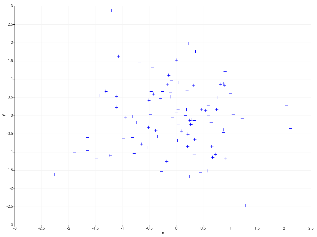
This example shows how to create a 2D scatter plot from 100 randomly sampled
datapoints using scatter(). By default, the chart automatically
rescales its axes such that all plotted data is visible. By right clicking on the chart
you can enable zooming and panning of the chart.
x = rng.standard_normal(100)
y = rng.standard_normal(100)
chart = pv.Chart2D()
chart.scatter(x, y, size=10, style='+')
chart.show()
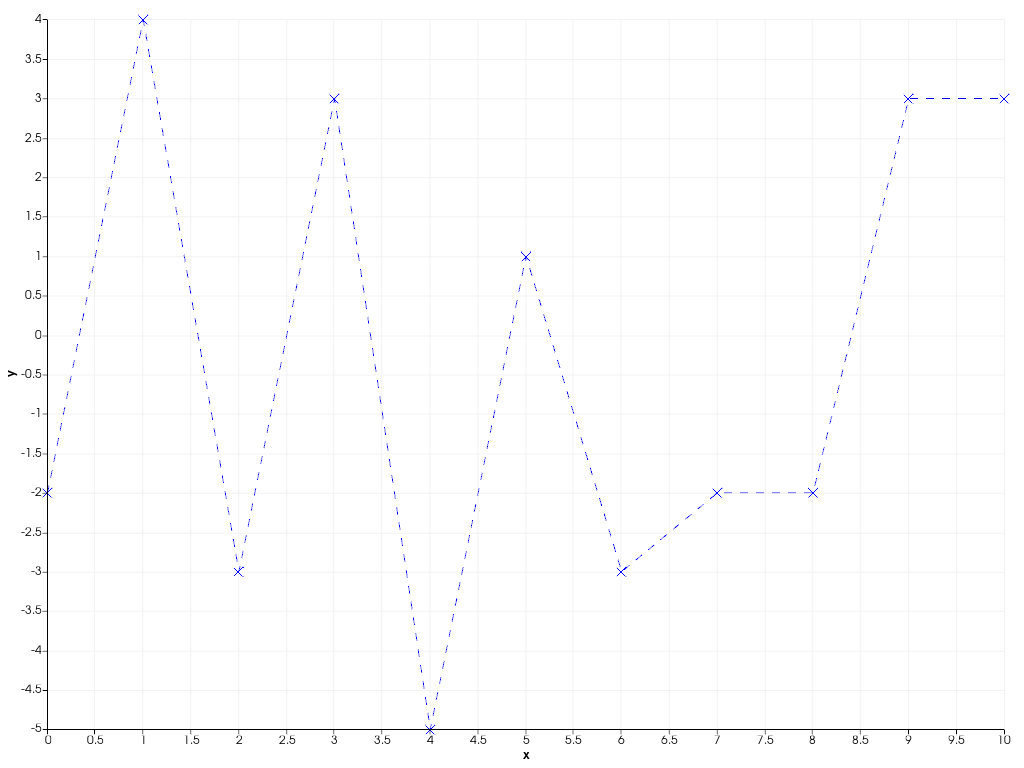
To connect datapoints with lines, you can create a 2D line plot as shown in
the example below using line(). You can also dynamically
'zoom in' on the plotted data by specifying a custom axis range yourself.
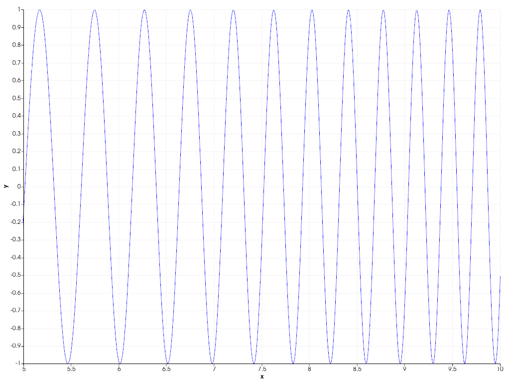
You can also easily combine scatter and line plots using the general
plot() function, specifying both the line and marker
style at once.
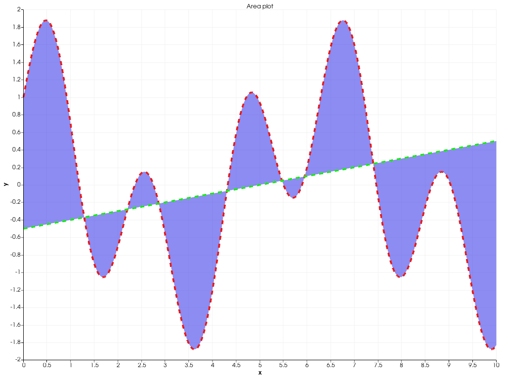
The following example shows how to create filled areas between two polylines
using area().
x = np.linspace(0, 10, 1000)
y1 = np.cos(x) + np.sin(3 * x)
y2 = 0.1 * (x - 5)
chart = pv.Chart2D()
chart.area(x, y1, y2, color=(0.1, 0.1, 0.9, 0.5))
chart.line(x, y1, color=(0.9, 0.1, 0.1), width=4, style='--')
chart.line(x, y2, color=(0.1, 0.9, 0.1), width=4, style='--')
chart.title = 'Area plot'  # Set custom chart title
chart.show()
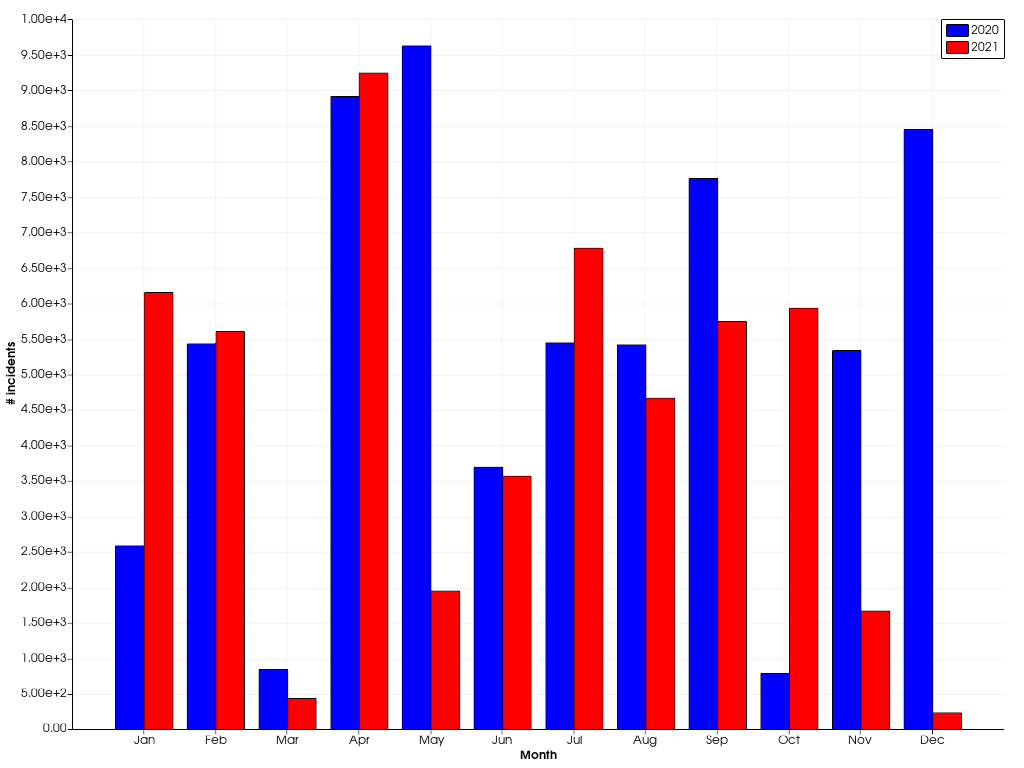
Bar charts are also supported using bar().
Multiple bar plots are placed next to each other.
x = np.arange(1, 13)
y1 = rng.integers(1e2, 1e4, 12)
y2 = rng.integers(1e2, 1e4, 12)
chart = pv.Chart2D()
chart.bar(x, y1, color='b', label='2020')
chart.bar(x, y2, color='r', label='2021')
chart.x_axis.tick_locations = x
chart.x_axis.tick_labels = [
    'Jan',
    'Feb',
    'Mar',
    'Apr',
    'May',
    'Jun',
    'Jul',
    'Aug',
    'Sep',
    'Oct',
    'Nov',
    'Dec',
]
chart.x_label = 'Month'
chart.y_axis.tick_labels = '2e'
chart.y_label = '# incidents'
chart.show()
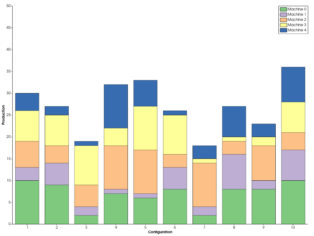
バーを横に並べて描くのではなく,重ねて描きたい場合は,yの値を連続して渡します.
x = np.arange(1, 11)
ys = [rng.integers(1, 11, 10) for _ in range(5)]
labels = [f'Machine {i}' for i in range(5)]
chart = pv.Chart2D()
chart.bar(x, ys, label=labels)
chart.x_axis.tick_locations = x
chart.x_label = 'Configuration'
chart.y_label = 'Production'
chart.grid = False  # Disable the grid lines
chart.show()
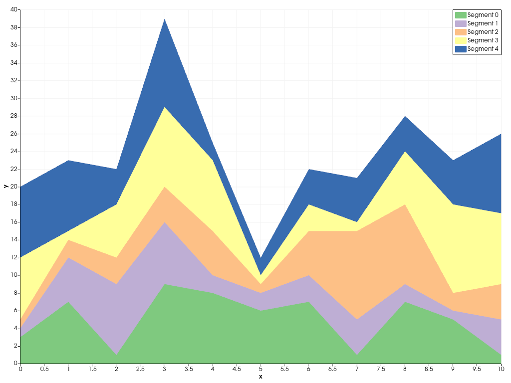
In a similar way, you can stack multiple area plots on top of
each other using stack().
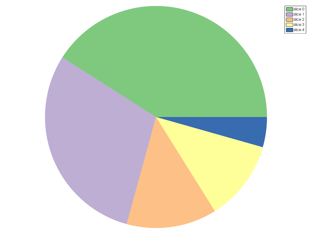
Beside the flexible Chart2D used in the previous examples, there are a couple
other dedicated charts you can create. The example below shows how a pie
chart can be created using ChartPie.
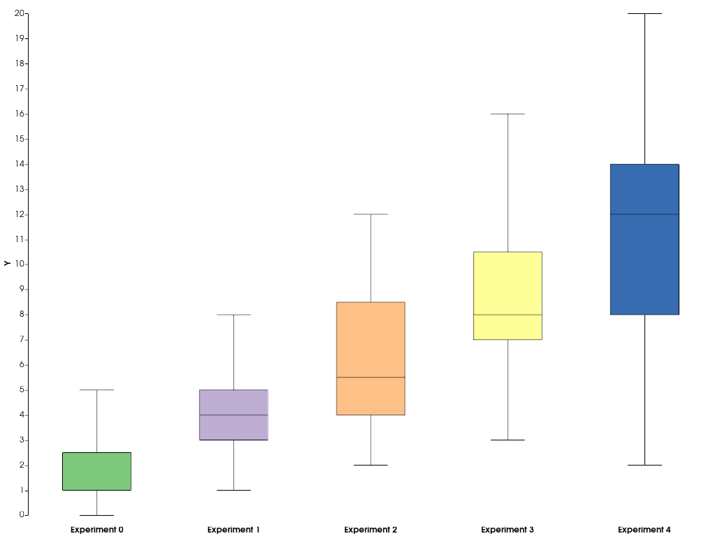
To summarize statistics of datasets, you can easily create a boxplot
using ChartBox.
data = [rng.poisson(lam, 20) for lam in range(2, 12, 2)]
chart = pv.ChartBox(data)
chart.plot.labels = [f'Experiment {i}' for i in range(len(data))]
chart.show()
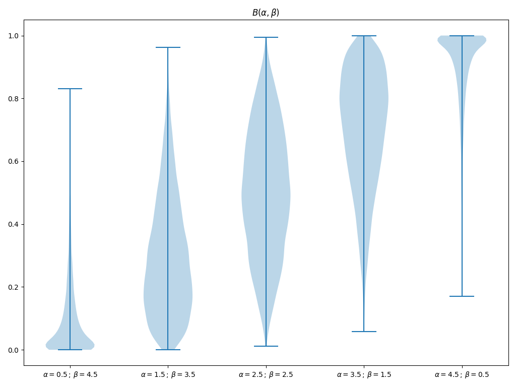
pyvistaやVTKでサポートされていない他のタイプのチャートを追加したい場合は,matplotlibを使ってカスタムチャートを作成し,pyvistaのプロットウィンドウに埋め込むことができます.以下の例は,これをどのように行うかを示しています.
import matplotlib.pyplot as plt

# First, create the matplotlib figure
f, ax = plt.subplots(
    tight_layout=True,
)  # Tight layout to keep axis labels visible on smaller figures
alphas = [0.5 + i for i in range(5)]
betas = [*reversed(alphas)]
N = int(1e4)
data = [rng.beta(alpha, beta, N) for alpha, beta in zip(alphas, betas)]
labels = [f'$\\alpha={alpha:.1f}\\,;\\,\\beta={beta:.1f}$' for alpha, beta in zip(alphas, betas)]
ax.violinplot(data)
ax.set_xticks(np.arange(1, 1 + len(labels)))
ax.set_xticklabels(labels)
ax.set_title('$B(\\alpha, \\beta)$')

# Next, embed the figure into a pyvista plotting window
p = pv.Plotter()
chart = pv.ChartMPL(f)
chart.background_color = 'w'
p.add_chart(chart)
p.show()
Total running time of the script: (0 minutes 2.775 seconds)