注釈
Go to the end to download the full example code.
画像データの表現#
この例では、 points_to_cells() と cells_to_points() を使って ImageData をリメッシュする方法を示します。
ImageDataFilters.image_threshold (点ベース)や DataSetFilters.threshold (セルベース)のような点ベースやセルベースのフィルタを使用する際やプロットを生成する際に、画像データが適切な表現を持つようにするためにこれらのフィルタを使用することができます。
3Dボリュームの表現#
8つの点と離散スカラーデータ配列で3Dボリュームの画像データを作成します。
from __future__ import annotations

import numpy as np

import pyvista as pv


data_array = [8, 7, 6, 5, 4, 3, 2, 1]
points_volume = pv.ImageData(dimensions=(2, 2, 2))
points_volume.point_data['Data'] = data_array
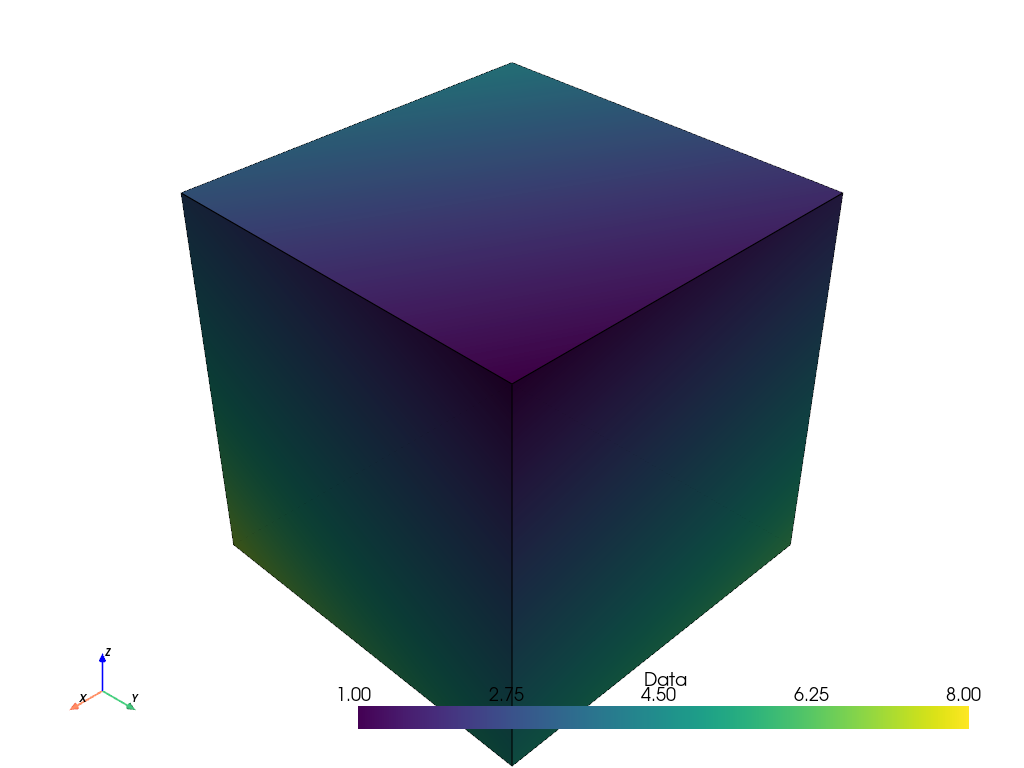
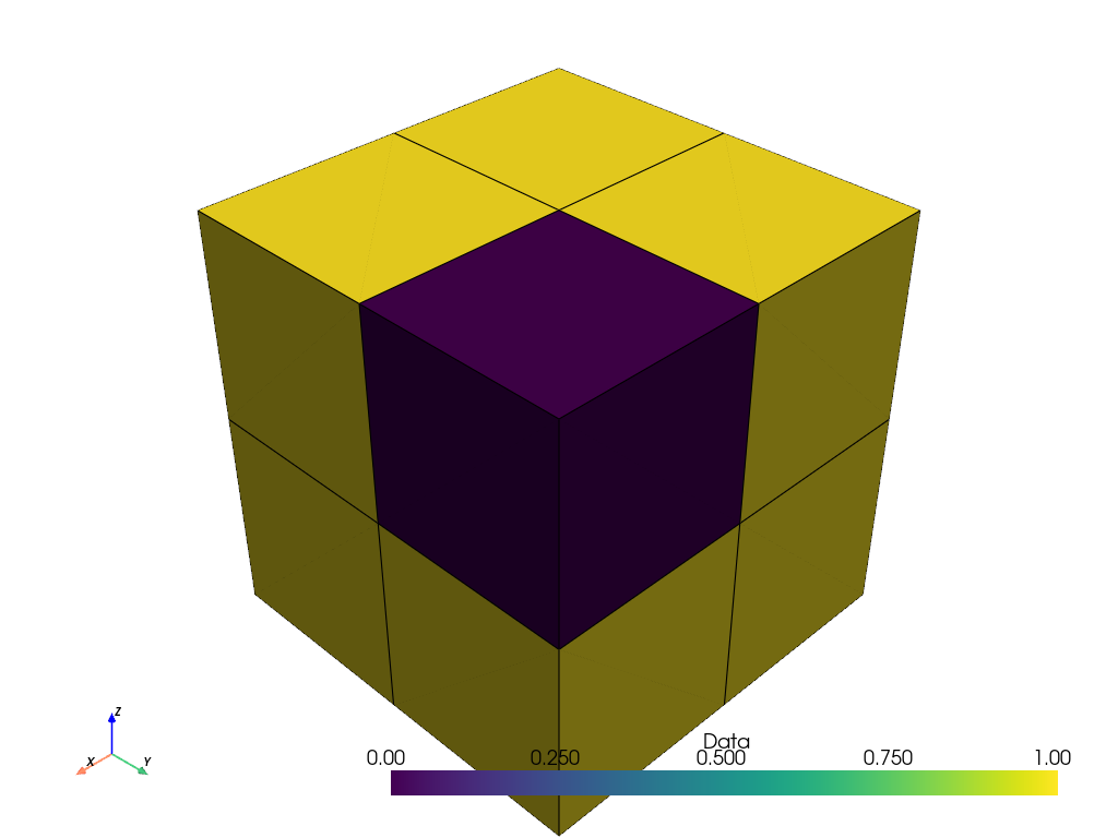
体積をプロットすると、それは8つの点を持つ1つのセルとして表現され、点データはセルを着色するために補間されます。
points_volume.plot(show_edges=True)
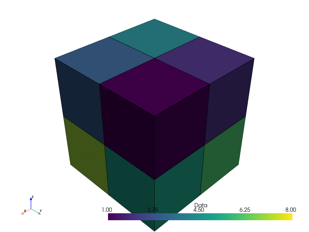
しかし、多くのアプリケーション(例えば3D医療画像)では、スカラーデータ配列はボクセルの中心で離散化されたサンプルを表しています。そのため、8点ではなく8ボクセルのセルとしてデータを表現する方が適切かもしれません。 points_to_cells() を使って、セルベースの表現を生成することができます。
cells_volume = points_volume.points_to_cells()
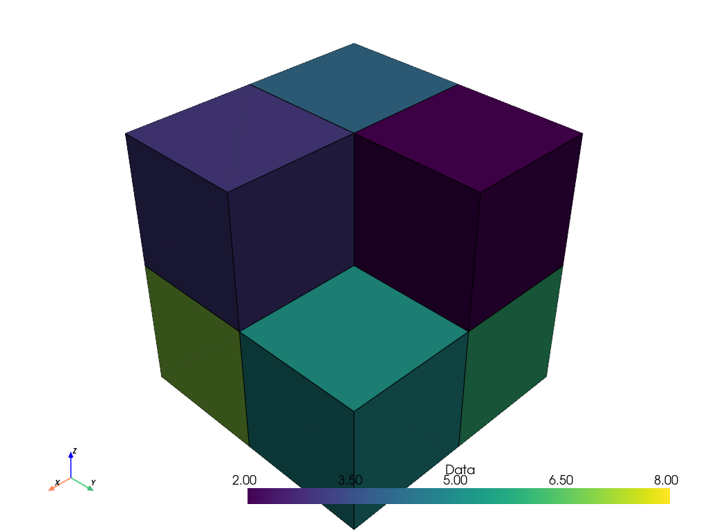
さて、体積をプロットするとき、8つのボクセルでより適切な表現ができ、スカラーデータは補間されなくなりました。
cells_volume.plot(show_edges=True)
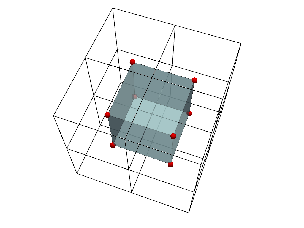
比較のために2つの表現をプロットしてみましょう。
可視化のために、点ボリューム(内側のメッシュ)には色を付け、セルボリューム(外側のメッシュ)のエッジのみを表示します。またセルの中心を赤でプロットします。 セル画像の中心が点画像の点とどのように対応しているかに注意してください。
cell_centers = cells_volume.cell_centers()
cell_edges = cells_volume.extract_all_edges()

plot = pv.Plotter()
plot.add_mesh(points_volume, color=True, show_edges=True, opacity=0.7)
plot.add_mesh(cell_edges, color='black', line_width=2)
plot.add_points(
    cell_centers,
    render_points_as_spheres=True,
    color='red',
    point_size=20,
)
plot.camera.azimuth = -25
plot.camera.elevation = 25
plot.show()
1種類のスカラーデータ(つまり、点データかセルデータのどちらか一方であり、両方ではない)だけを使用する限り、データを失うことなく表現間を移動することが可能です。
array_before = points_volume.active_scalars
array_after = points_volume.points_to_cells().cells_to_points().active_scalars
np.array_equal(array_before, array_after)
True
画像データによるポイントフィルター#
image_threshold() のような点ベースのフィルタを使用する場合は、画像の点表現を使用します。 画像にセルデータしかない場合は、 cells_to_points() を使用して、まず入力をメッシュし直します。 ここでは、先に定義した点ベースの画像を再利用します。
文脈のために、まず入力データの配列を示します。
points_volume.point_data['Data']
pyvista_ndarray([8, 7, 6, 5, 4, 3, 2, 1])
フィルターを適用し、結果をプリントします。
points_ithresh = points_volume.image_threshold(2)
points_ithresh.point_data['Data']
pyvista_ndarray([1, 1, 1, 1, 1, 1, 1, 0])
フィルタは期待通りに2進数の点データを返します。 値が閾値 2 と等しいか、閾値より大きい場合は1となり、閾値より小さい場合は0となります。
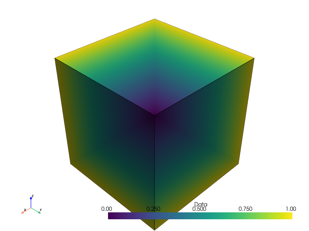
しかし、それをプロットする際、点値は線形補間されます。 バイナリデータの可視化には、この補間は望ましくありません。
points_ithresh.plot(show_edges=True)
結果をより見やすくするために、プロットする前に points_to_cells() でフィルターが返す点の画像をセル表現に変換します。
points_ithresh_as_cells = points_ithresh.points_to_cells()
points_ithresh_as_cells.plot(show_edges=True)
バイナリーデータが正しくバイナリーデータとして可視化されました。
画像データによるセルフィルター#
threshold() のようなセルベースのフィルタを使用する場合は、画像のセル表現を使用します。 画像に点データしかない場合は、 points_to_cells() を使用して、まず入力をメッシュし直します。 ここでは、先に作成したセルベースの画像を再利用します。
文脈のために、まず入力データの配列を示します。
cells_volume.cell_data['Data']
pyvista_ndarray([8, 7, 6, 5, 4, 3, 2, 1])
フィルターを適用し、結果をプリントします。
cells_thresh = cells_volume.threshold(2)
cells_thresh.cell_data['Data']
pyvista_ndarray([8, 7, 6, 5, 4, 3, 2])
入力がセルデータの場合、このフィルターは期待通り、閾値 2 以上の7つの離散値を返します。
その結果をプロットすると、セルも正しく可視化されます。
cells_thresh.plot(show_edges=True)
しかし、同じフィルターを画像の点ベースの表現に適用すると、フィルターは望ましい結果をもたらしません。
points_thresh = points_volume.threshold(2)
points_thresh.point_data['Data']
pyvista_ndarray([8, 7, 6, 5, 4, 3, 2, 1])
この場合、点の画像にはセルが1つしかないので、フィルターはデータ配列の値には影響しません。しきい値は入力値と同じです。
結果をプロットすると、このことが確認できます。 このプロットは、この例の冒頭で示した点ベースの画像の初期プロットと同じです。
points_thresh.plot(show_edges=True)

2D画像の表現#
points_to_cells() と cells_to_points() というフィルターも同様に2D画像で使用できます。
この例では、16ピクセルを表す16点の4x4の2Dグレースケール画像を作成します。
data_array = np.linspace(0, 255, 16, dtype=np.uint8)[::-1]
points_image = pv.ImageData(dimensions=(4, 4, 1))
points_image.point_data['Data'] = data_array
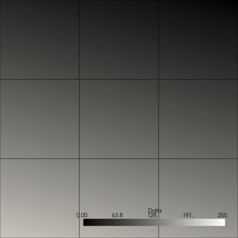
画像をプロットします。以前と同様、点データは補間されているため、プロットは正しく表示されず、望ましい16個のセル(各ピクセルに1個)ではなく、9個のセルが表示されています。
plot_kwargs = dict(
    cpos='xy',
    zoom='tight',
    show_axes=False,
    cmap='gray',
    clim=[0, 255],
    show_edges=True,
)
points_image.plot(**plot_kwargs)
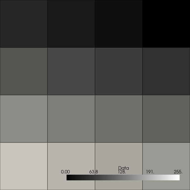
画像を正しく可視化するために、まず points_to_cells() を使って画像のセルベース表現を取得し、その結果をプロットします。 このプロットでは、16ピクセルのセルが離散的な値で正しく表示されます。
cells_image = points_image.points_to_cells()
cells_image.plot(**plot_kwargs)
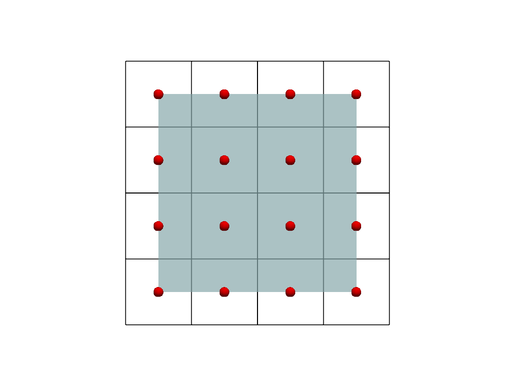
比較のために2つの表現をプロットしてみましょう。
可視化のために、点の画像(内側のメッシュ)に色を付け、セルの画像(外側のメッシュ)をワイヤーフレームとして表示します。 またセルの中心を赤でプロットします。 セル画像の中心が点画像の点とどのように対応しているかに注意してください。
cell_centers = cells_image.cell_centers()

plot = pv.Plotter()
plot.add_mesh(points_image, color=True, opacity=0.7)
plot.add_mesh(cells_image, style='wireframe', color='black', line_width=2)
plot.add_points(
    cell_centers,
    render_points_as_spheres=True,
    color='red',
    point_size=20,
)
plot.view_xy()
plot.show()
Total running time of the script: (0 minutes 2.674 seconds)